As you probably know I’m a cofounder and User Interface Designer at Intense Debate. We just released a big update to our revolutionary commenting system, that’s basically a total makeover graphically. I think you can tell that I’m excited!
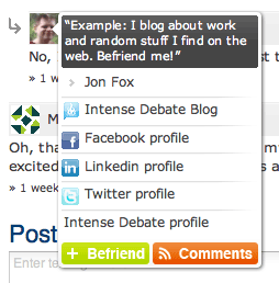 One of the most noticable changes/improvements is the “User Information Box” that displays when you hover an avatar. It’s almost like a mini-profile-mashup from alot of different things. The idea is that it should tell you alot about the person you’re interested in, and still look OK if the person has not supplied much data. A screenshot of this new feature is next to this paragraph.
There’s much more to this update, if you’re interested I suggest you go read (and subscribe!) to our company blog: Inside the Debate.
Well.. It's more like a subtle "little extra something". It's a CSS hover btw. If you click you should see a darker grey for a split second as well.. Right now I see this trend of not using as many hover effects on the internet, but instead using the :active pseudo class. It makes the web seem more desktop-app-like, which in my mind is a good thing. And the feeling of pressing a button with an :active state is very nice imo. 🙂
It's definately getting more in the fashion right now. 🙂
Thanks!
Why, thanks! I hope you go ahead and install Intense Debate on your blog asap now 😉
Thanks dude. 🙂
I love it!
I’m always thanks for people who still care to blog spot blog when there is a wordpress. Because believe or not, many people now only develop plug-in, add on, widget, for wordpress. Poor blog spot…
H mm intense debate is cool, but i think since commentluv is already able to be used, i will use commentluv.
I can’t seem to fully load this page from my droid!
What’s broken with it? I recently updated the blog’s design, you might see some complications due to the changes.