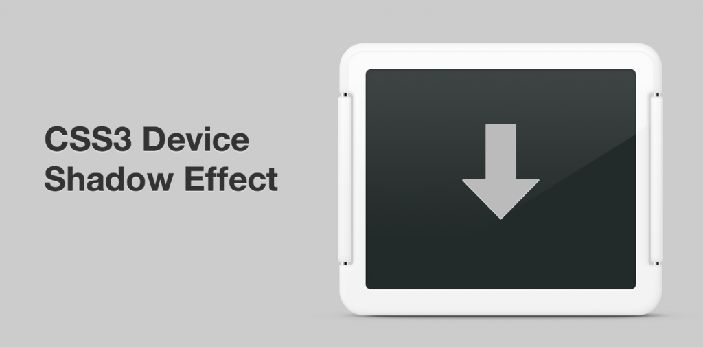
There are many neat things you can do with the box-shadow property in CSS. Many of them we see almost everywhere now, including the famed paper curl effect.
One effect I haven’t seen around though is a cast drop shadow, the kind you usually see under a device shot – for example an iPhone 5. I recently had the opportunity to create such a shadow for the refresh of the WordPress for Android home page.
The Idea
A drop shadow that’s more blurry towards the right and left sides, automatically adjusts to its parent element for width, and has a subtle skew for depth. Preferably using CSS pseudo elements rather than adding to the markup.
CSS & Markup Walkthrough
You need a parent element that is not a <img /> tag, since pseudo elements won’t work on the image itself. Other than that the HTML is pretty straightforward:
<div id="device">

<img src="#" width="#" height="#" alt="#" />

</div>
The #device element should have the same constraints as the image inside it, otherwise the shadow won’t be aligned properly. Relative positioning is also needed so that the pseudo element’s x/y coordinates are taken from the parent element and not the HTML body. The perspective property is important, it tells the browser how big the 3D space is.
#device {

width: 312px;

height: 264px;

position: relative;

perspective: 600px;

}
The image needs to be positioned above the pseudo element which is easily accomplished with this CSS:
#device img {

position: relative;

z-index: 2;

}
Now we’re getting to the good stuff. The pseudo element that will create the device shadow! First the basics. Pseudo elements are meant to be used for adding things like quote marks to a paragraph of text, but with a little trickery you can make it act like any other HTML element: add content: ""; and display: block;. Position absolute and a z-index means it’ll show up below the image, and the height + bottom px value sets it’s alignment with the bottom edge of the element.
content: "";

display: block;

position: absolute;

z-index: 1;

bottom: 1px;

height: 2px;
The shadow size settings is the tricky part. Since the shadow is scaled up 10x later to make it extra blurry on the right and left sides, you need to enter a tenth of the width you ultimately want here. You also have to make sure that the left value (X axis) is a negative half of the width.
/* Shadow size */

width: 8%;

left: -4%;

margin: 0 0 0 50%;
The transform property scales the element to be 10x wider, while making it slightly thinner, greatly exaggerating the drop shadow’s blurriness on the left/right sides compared to top/bottom. RotateX(45deg) gives the element a slight depth.
transform: rotateX(45deg) scale(10, .75);
Time to fill the element, both in and around. The solid black background color and multiple layered box shadows make the element easier to work with in different environments where you may want a different weight to the entire shadow. Thanks to the first few drop shadows being tight around the shape of the element and then branching out, there’s no hard line in between where the element stops and the drop shadow begins.
background: #000;

box-shadow: 0 0 1px #000, 0 0 2px #000, 0 0 3px #000, 0 0 5px #000, 0 0 5px #000, 0 0 5px #000, 0 0 7px #000, 0 0 12px #000;
Finally, setting the opacity property to the entire pseudo element allows us to change the weight of the drop shadow on the fly and easily adapt it in animations and similar.
-moz-opacity:.65;

filter:alpha(opacity=65);

opacity:.65;
The Result
This is what all the CSS looks like combined (View Demo):
#device {
    width: 312px;
	height: 264px;
	position: relative;
	-webkit-perspective: 600px;
	-moz-perspective: 600px;
	-ms-perspective: 600px;
	-o-perspective: 600px;
	perspective: 600px;
}

#device img {
	position: relative;
	z-index: 2;
}

#device:after {
	content: "";
	display: block;
	position: absolute;
	z-index: 1;
	bottom: 1px;
	height: 2px;

	/* Shadow size */
	width: 8%; /* Add a 10th of the width you want (scaled up later) */
	left: -4%; /* Half of the 10th of the width! */
	margin: 0 0 0 50%; /* Centers element before it's upscaled, don't change this */

	/* Transform: rotateX to create depth, scale to 10x to make left/right more blurry than top/bottom */
	-moz-transform: rotateX(45deg) scale(10, .75);
	-ms-transform: rotateX(45deg) scale(10, .75);
	-o-transform: rotateX(45deg) scale(10, .75);
	-webkit-transform: rotateX(45deg) scale(10, .75);
	transform: rotateX(45deg) scale(10, .75);

	/* Apply shadow & background */
	background: #000;
	-moz-box-shadow: 0 0 1px #000, 0 0 2px #000, 0 0 3px #000, 0 0 5px #000, 0 0 5px #000, 0 0 5px #000, 0 0 7px #000, 0 0 12px #000;
	-o-box-shadow: 0 0 1px #000, 0 0 2px #000, 0 0 3px #000, 0 0 5px #000, 0 0 5px #000, 0 0 5px #000, 0 0 7px #000, 0 0 12px #000;
	-webkit-box-shadow: 0 0 1px #000, 0 0 2px #000, 0 0 3px #000, 0 0 5px #000, 0 0 5px #000, 0 0 5px #000, 0 0 7px #000, 0 0 12px #000;
	-ms-box-shadow: 0 0 1px #000, 0 0 2px #000, 0 0 3px #000, 0 0 5px #000, 0 0 5px #000, 0 0 5px #000, 0 0 7px #000, 0 0 12px #000;
	box-shadow: 0 0 1px #000, 0 0 2px #000, 0 0 3px #000, 0 0 5px #000, 0 0 5px #000, 0 0 5px #000, 0 0 7px #000, 0 0 12px #000;

	/* Change opacity of entire element to tint shadow */
	-moz-opacity:.65;
	filter:alpha(opacity=65);
	opacity:.65;
}
That’s it for today. Hope this helps!

Looks really sharp! Nice job.
Why thank you!
this is awesome!
Really really cool use of CSS3